Event logo design is of my specialities, and gosh do I love it. After designing the Montane Lakeland 2021 and 2022 logos, I was invited back for the third year in a row in 2023. What the Montane Lakeland 50 & 100 theme will be each year is always met with great anticipation, not least by me, because it will form the backbone of the brief I’m given to work from. The design will be carried across medals, tshirts and merchandise. Some people will even get these logos tattooed to celebrate their success! So it’s important to get it right.
Photos (above) courtesy of No Limits Photography, who for events like this are the photographers you wanna call!
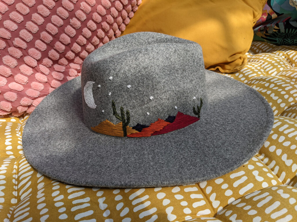
When I got the call to say that this year’s theme would be “Western”, inspired by the Amazon TV Show “Yellowstone”, I was certainly intrigued. It wasn’t long before I was searching for episodes of the show to watch, immersing myself in all things Western, and even purchasing my very own cowboy hat, which I would later embroider, nearly destroying my fingers in the process.

The logo design itself was an enjoyable one to explore. Knowing that it would be used on a belt buckle rather than a traditional medal this year gave me a constraint to work in that I quite enjoyed. Traditionally, Western belt buckles might feature cacti, longhorn steers or bucking broncos. As those things tend to be rarely seen in the Lake District, I would need to find another way to design to this theme.
As the race spans such an enormous area of the Lake District, taking in many different views, across a lot of different terrain, I couldn’t simply illustrate one view. And besides, the illustration needed to work alongside other elements of the design. So artistic licence came in to play. Using many different reference shots of points along the route, I began sketching, eventually coming up with the lake and mountain design that would sit behind the ribbon of text. Detail was added and taken away until I was happy the design would work in print, and immortalised as a belt buckle.
One thing I hadn’t been given in the brief was a strapline. In my research sessions on the theme I had come across a quote from the Yellowstone TV Show. It read:
“Well, it’s hard to measure an ‘almost’ because ‘almost’ doesn’t matter.”
“Where ‘almost’ doesn’t matter”
That’s it. That’s the tagline. For a race that has a notoriously high drop out rate, a race that puts people not just through an incredibly difficult physical challenge, but a mental one too, THAT’S what I’d be telling myself when the going gets tough. I ran it by the race director. He loved it. And that’s when I decided I’d become a copywriter.
Only kidding. I think you’re safe fellow copywriters. I’m clearly a one trick pony when it comes to copywriting ????
If you have an event that needs a logo design – get in touch!
#