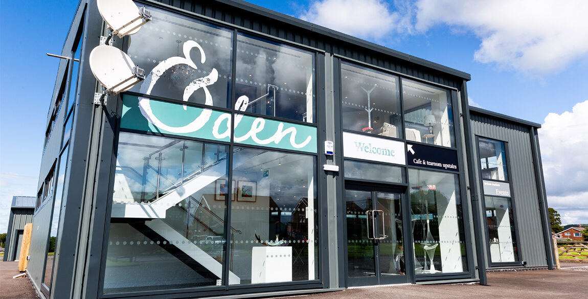
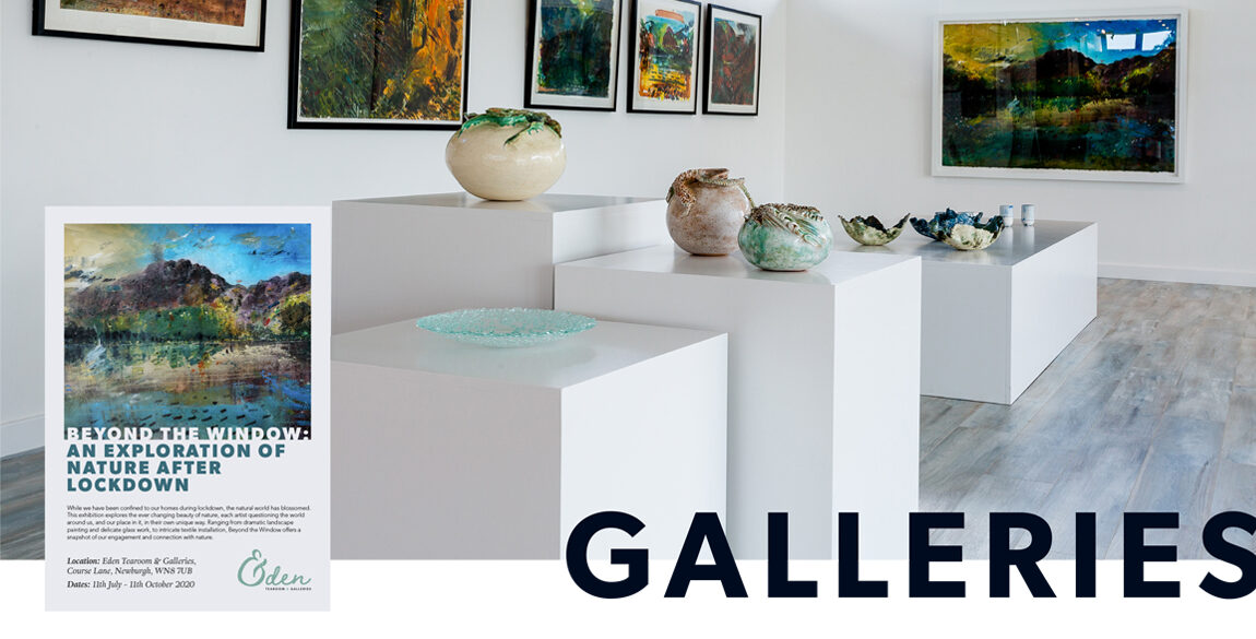
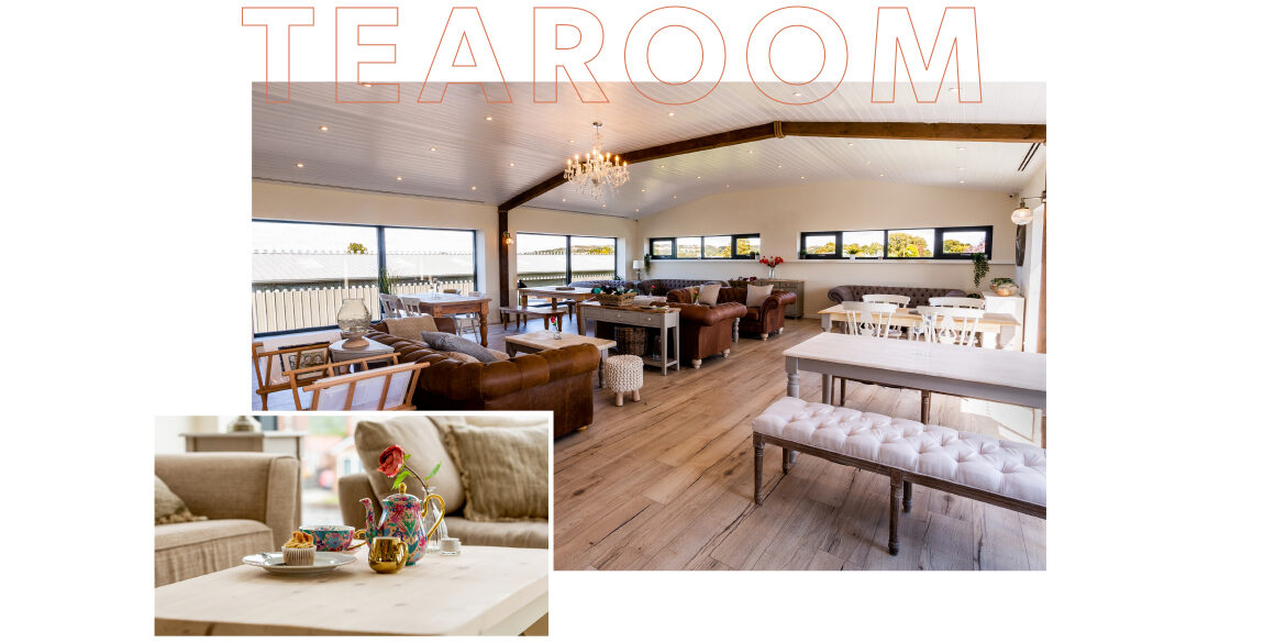
Eden Tearoom and Galleries is an arts complex and tearoom in the village of Newburgh, Lancashire. Not far from Parbold, the building, which is on the site of an old strawberry farm, houses the elegant tearoom complete with deli counter, the art gallery, artisan retail space and a workshop area.
Many thanks to Lancashire Photographer Helen Riley Photography for permission to use the photos featured on this page!
The client was keen that the Eden brand identity communicate:
A lot of thought and attention to detail had gone into the interior at this point. It needed to appeal to a large audience. From families and Mum and baby groups, to creatives and informal business meetings – the venue was welcoming to all.
It was important to the client that the brand should not be too “typical tearoom” in it’s visual identity. Additionally, any exterior graphics needed to soften what is a rather industrial building. The identity would be used across a range of print and digital media. It would also, in time, have sub-brands such as the deli and street food kitchen.
Lyndsey took hold of the idea that Eden was a place for so much – a tearoom, a deli, an artisan market, an art gallery, maker workshops, pottery classes and more.
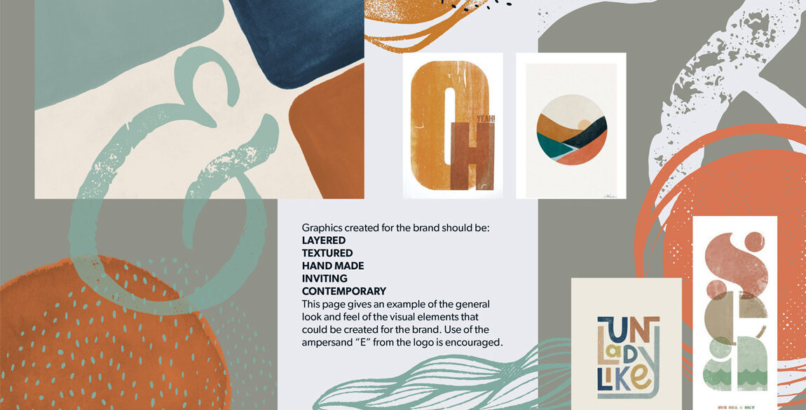
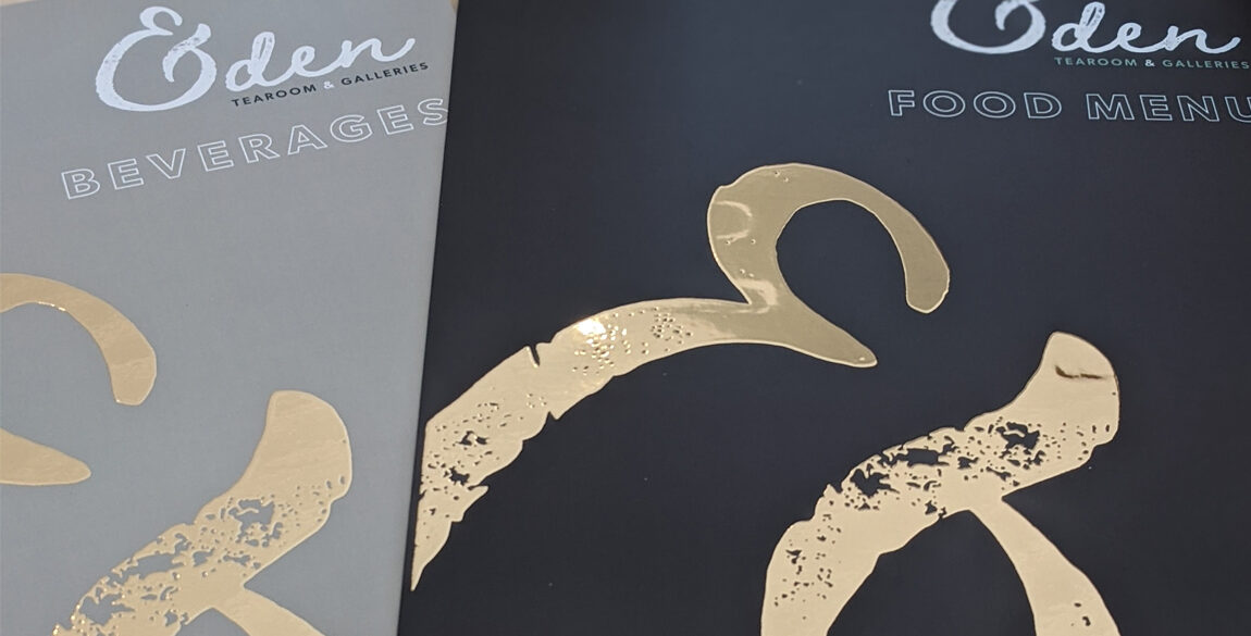
It was the “and more” that set her off in the direction of using an ampersand in place of the “E” on “Eden”. The ampersand was developed so that it would be legible as the “E” but also work on it’s own as a monogram, or cropped in the background of a design.
The style developed for the brand is:
It is intended that the use of layers further represents everything on offer at Eden, but it also serves to soften the aforementioned exterior of the building.
Colour, as always, also plays an important role in the visual style. It had to be complimentary to the interior decisions the client had made, not overly feminine, and work for both the tearoom and the gallery. Lyndsey chose a palette that could be used with versatility, introducing warm hues that came from the clients love of pottery.
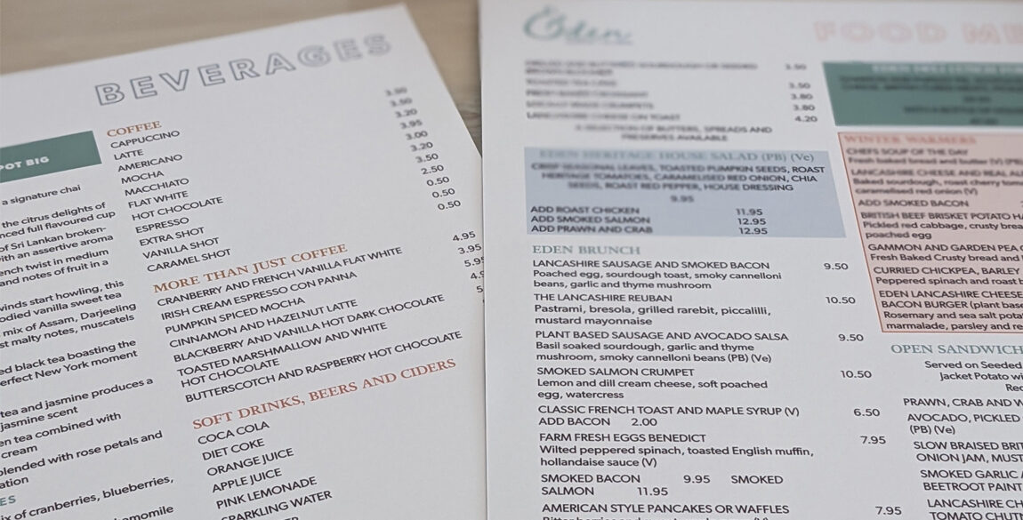
The combination of typefaces chosen for the brand is Adriane and Gibson. The subtle, unexpected details of Adriane are balanced out by the reliable, forthright communication of Gibson. Each of these typefaces is so versatile it can perform equally well as a headline or in paragraph text. This allows for more flexibility with design and means the typographic elements can function well in layered and textured graphics.
Looking for something similar?
We love working on branding for new businesses, contact us for a chat! We can handle design, photography and copywriting. Our team of creative professionals rival any design agency.
#