Client: Midwifery Unit Network (MUNet)
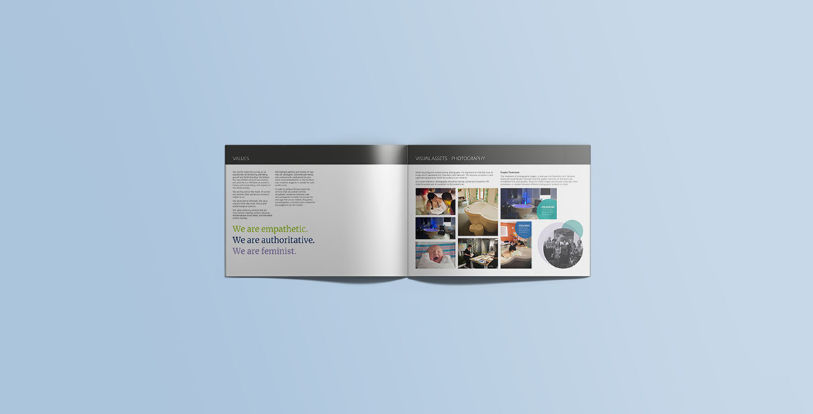
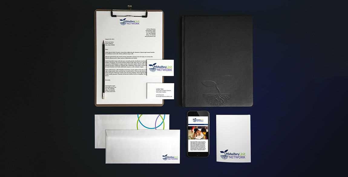
The Midwifery Unit Network are a not for profit organisation. They provide information, support and networking amongst people interested in midwifery-led units (MLUs) across Europe. The Midwifery Unit Academy needed a brand refresh in order to feel confident in advertising their training programmes. They wanted to keep aspects of the original logo, but move the brand forward so the visual identity represents the organisation in the most professional way possible. They need to be seen as as an authority on the subject of midwifery units. The brand also needed to display their empathetic personality and feminist principles.
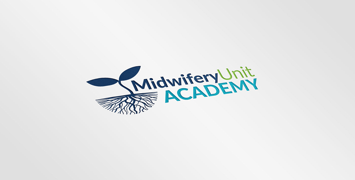
In addition, they also required a logo for their Academy. The Academy provides training, resources and information for professionals within the industry.
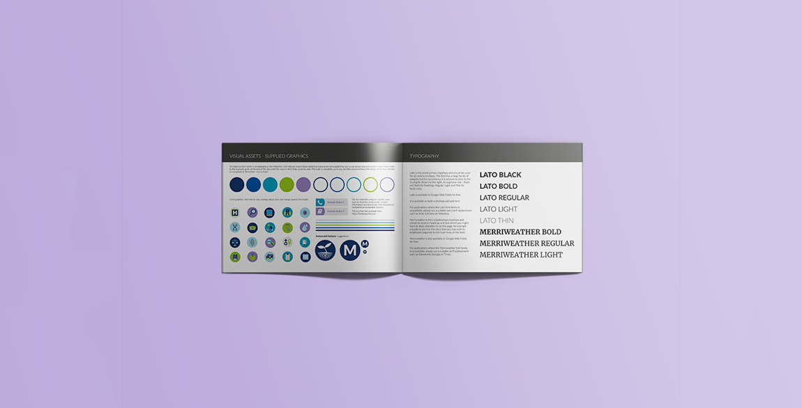
As someone passionate about midwifery care and the environments in which childbirth takes place, Lyndsey worked with the team at MUNet to really understand their organisation. A full set of brand guidelines were created, that could be easily implemented across all of their marketing, training and internal communications. This included guidance for both internal and external stakeholders.
The brand was launched at their July 2018 conference. The team were delighted and the brand is now in use across their new website, internal communications and external marketing literature.
Looking for something similar?
If you feel your company brand could do with a refresh, contact us for a chat! We have a full team of professional freelancers that can rival any design agency.
#