Do your presentation design, knock em dead, go to the Winchester and have a nice cold pint.
I remember when I was first ever asked to give a presentation. It was for an event in Liverpool, and I was invited to speak about my journey as a freelancer. I was absolutely chuffed at being asked to speak, almost crippled with nerves, but excited about getting to do a presentation design.
Excited you say? Yep!
Getting to design a presentation is not something most business owners love the idea of. Without design knowledge, designing slides can be a daunting task. But for me, it’s a chance to have some fun, especially when it’s my own thing, for my own business.
The idea of presentation design may actually never fill you with excitement (and if you REALLY don’t want to, or don’t have the time to do it – get in touch). It is, however, a necessary task in most businesses, at some point.
I have some tips to make the whole thing a bit easier, and hopefully not cause death by Powerpoint.
#1 Content first!
DO NOT, and I repeat, DO NOT start designing your presentation before you have your content written. It’s a backwards way of doing things and it will only cause you trouble. Trying to shoehorn content into a design because you love how it looks will be a nightmare. Decide what order you want everything to be in, make sure you’ve covered all your key points, and then, and ONLY then, you can get cracking…
#2 Strip that content back
But I just spent all that time creating it?! Yep, now strip back what you actually put on each slide. I’m not saying get RID of your content, but you do not need to put everything you want to say onto the slide itself. Otherwise, you end up just parroting everything that’s already up there on the slide for the audience to read. They’ll read it ahead of you saying it, and they’ll die of boredom. If you feel you need reminders of what to say – use the notes section that the audience can’t see!
If experience tells me anything, you’ll be trying to squeeze FAR too much content onto one slide. So here’s my challenge for you – make ONE point per slide. Just one. It may mean more slides in the end, but that’s better than cramming three points, a chart and a story about how you once gained inspiration from a pattern your dog left on the kitchen floor in mud.
#3 Get picky with your design choices
You can use these core principles of design to ensure consistency and clarity across your presentation design.
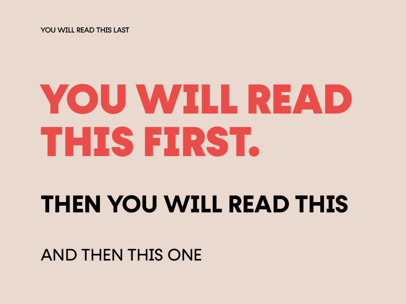
Bow down to the hierarchy
 Take your audience on a journey by making sure what you want them to read, in the order you want them to read it, is clear. Simple rules like making headings clear, having contrast between different types of content, and making sure everything is aligned, will get you off to a great start.
Choose your fonts wisely
You may already have a set of brand guidelines for your business. In this, fonts should be specified for headings and body copy. To ensure brand consistency, I would advise sticking to these. If you’re creating without a set of brand guidelines, then stick to just one or two fonts.
Don’t pick anything too fancy that your audience will struggle to read. Keep it simple. And pick something that matches the vibe of your presentation – you don’t want to be presenting about a serious subject with a font that looks like it belongs in The Beano.
Some fab font pairings are:
Be selective with your colours
Just like with fonts, you should probably already have a set of brand guidelines that tell you exactly what colours to use to stay on brand. But if you’re not quite there yet, just be sure to be selective. Limiting the colours you use will help with consistency and clarity.
Also be aware of the psychological impact and meanings of colours. Think about what perceptions you want to give your audience and pick colours that reflect that.
Use good quality images
And use them BIG! I’ve been known to use nothing but an image on one slide, filling the whole screen, if it’s the best thing to support what I have to say. If you’re stuck for where to find images – there are some brilliant free ones on UnSplash and Death to the Stock Photo, but beware, depending on your industry or presentation topic, you might not find something relevant on free image sites.
Stay away from anything that looks obviously like a stock image, keep the imagery consistent and on-brand too (something else that should be in your brand guidelines!), and don’t be afraid to show some personality!

Don’t go crazy on the animations
You know the saying “Just because you can, doesn’t mean you should”? This definitely applies to animation in presentations. Some animation will help with breaking everything up a bit. For example, if you’re talking through a graph, having each part of it display as you talk about it might be a nice way to communicate the data. Excessive use of of animations – for example, animating every change between slides, or every image on a page will get tiresome and look tacky.
#4 And if you take anything away from this at all – KISS.
Keep it simple, stupid.
Less is more.
Perfection is achieved, not when there is nothing more to add, but when there is nothing left to take away.” ― Antoine de Saint-Exupéry


