Beyond Swim is a national accreditation programme that helps open-water swimming venues offer safer and more consistent experiences. They asked me to design a wide range of materials that would support both venue operators and swimmers. The project included several detailed guidance documents, an interactive self-declaration checklist, roller banners for events and a new mobile-first participant guide.
Everything needed to follow the Beyond Swim brand while remaining clear, friendly and practical. My role was to turn a large volume of technical content into resources that were easy to read, simple to use and accessible to a wide audience. This included creating open-water swimming venue design guidance, as well as designing materials that swimmers could use directly on their phones.
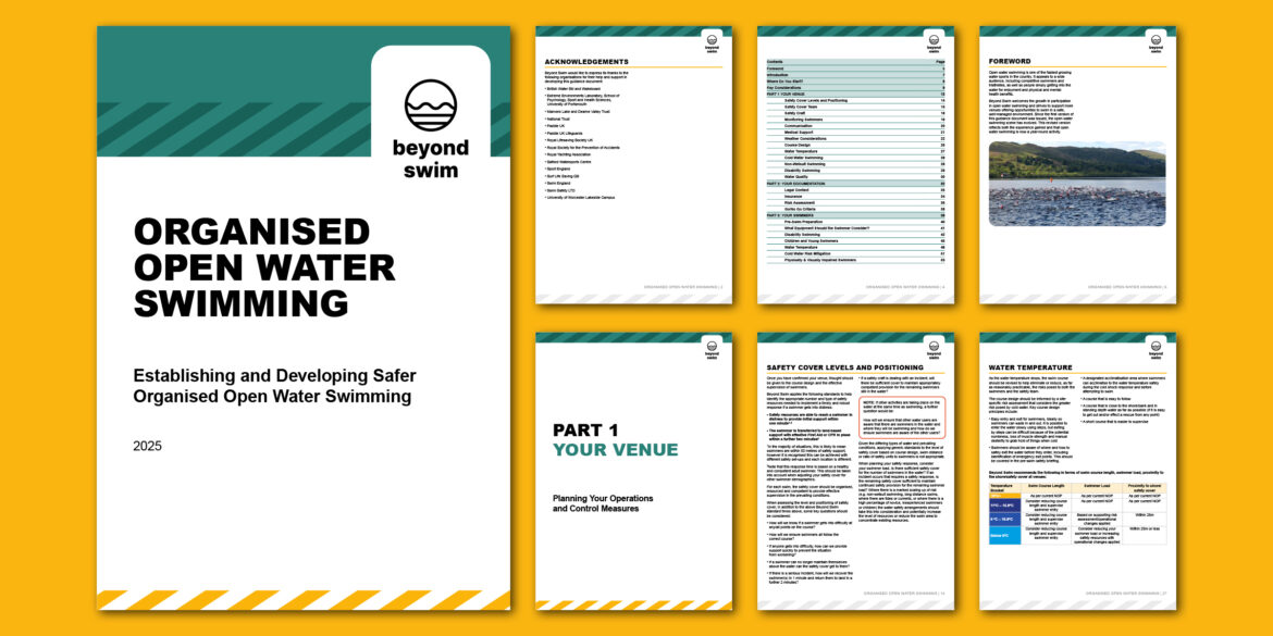
The main documents covered several areas of venue operation, from safer organised sessions to working with children and young people. The content already had a solid structure, so my role was to present it in a clear, predictable layout that supported easy navigation. Strong headings helped readers find key information quickly. I also used consistent spacing, pull-out details and short paragraphs to make technical content feel lighter and more approachable.
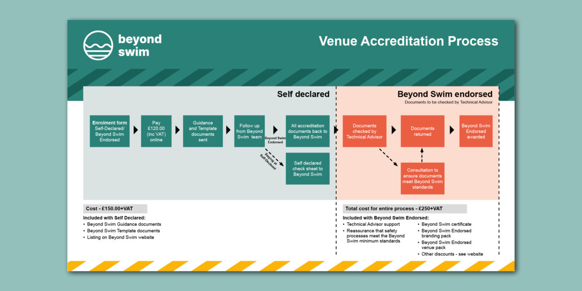
Beyond Swim wanted a simple way to explain how the accreditation programme works, and the costs associated with it. I designed a graphic that guides venues through each stage with short labels, clear direction and subtle brand elements. It now acts as a quick reference that appears across their materials.
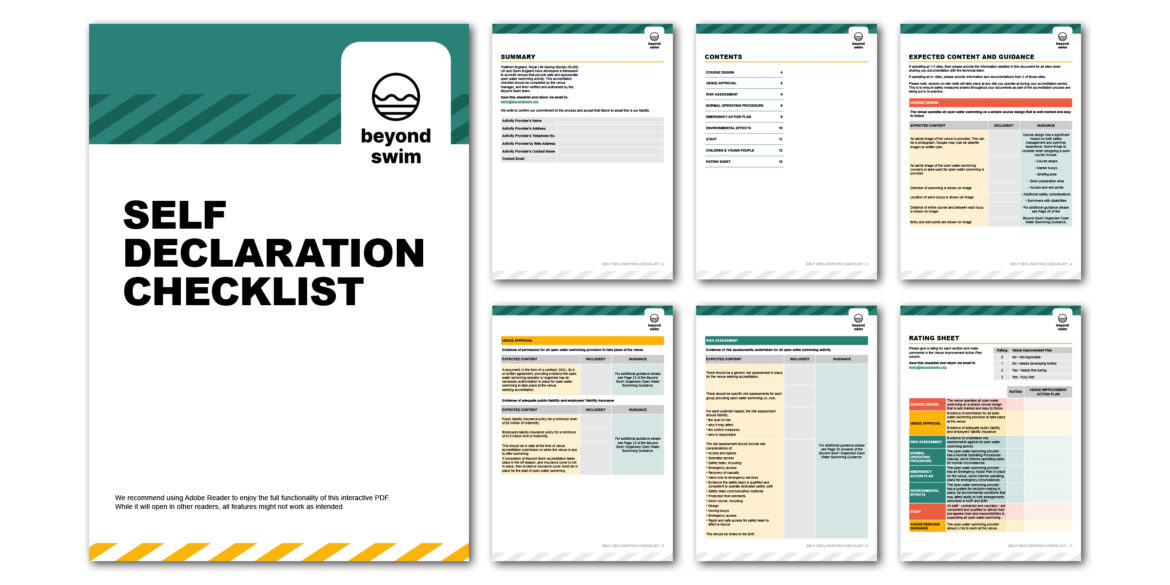
The self-declaration checklist was an important element. Venues needed a form they could complete digitally, without printing or scanning. I built an interactive PDF with drop-downs, tick boxes and text fields. This made the process easier for venue teams and created more consistent submissions for the Beyond Swim team.
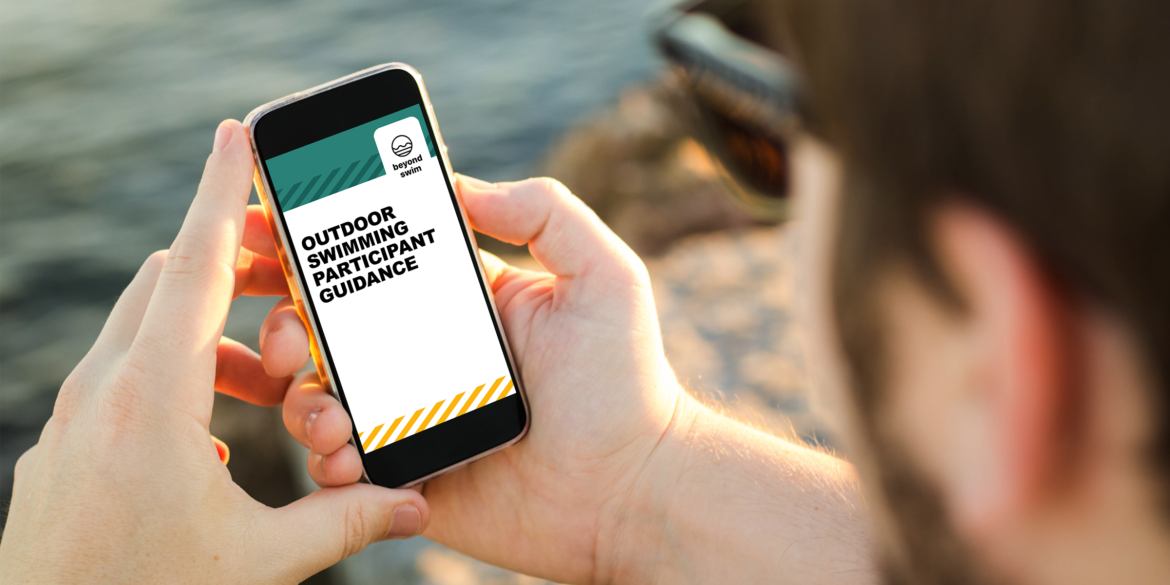
Beyond Swim wanted a guide that swimmers could read on the move, so I designed a mobile-first PDF that works naturally on a phone screen. The guide helps swimmers make informed decisions before, during and after outdoor swimming sessions. It covers water quality, weather awareness, equipment checks and safe on-site behaviour.
Because the audience ranges from beginners to regular outdoor swimmers, I focused on short paragraphs, clear headings and simple visual cues. The layout uses comfortable spacing and high-contrast typography, so each section is easy to scan outdoors, even in bright light. The guide includes practical advice, links to external resources and support for swimmers who want quick reassurance before getting into the water.
This piece complements the venue-focused documents by giving swimmers a resource they can trust, while maintaining the same friendly, professional tone that runs through the whole Beyond Swim programme.
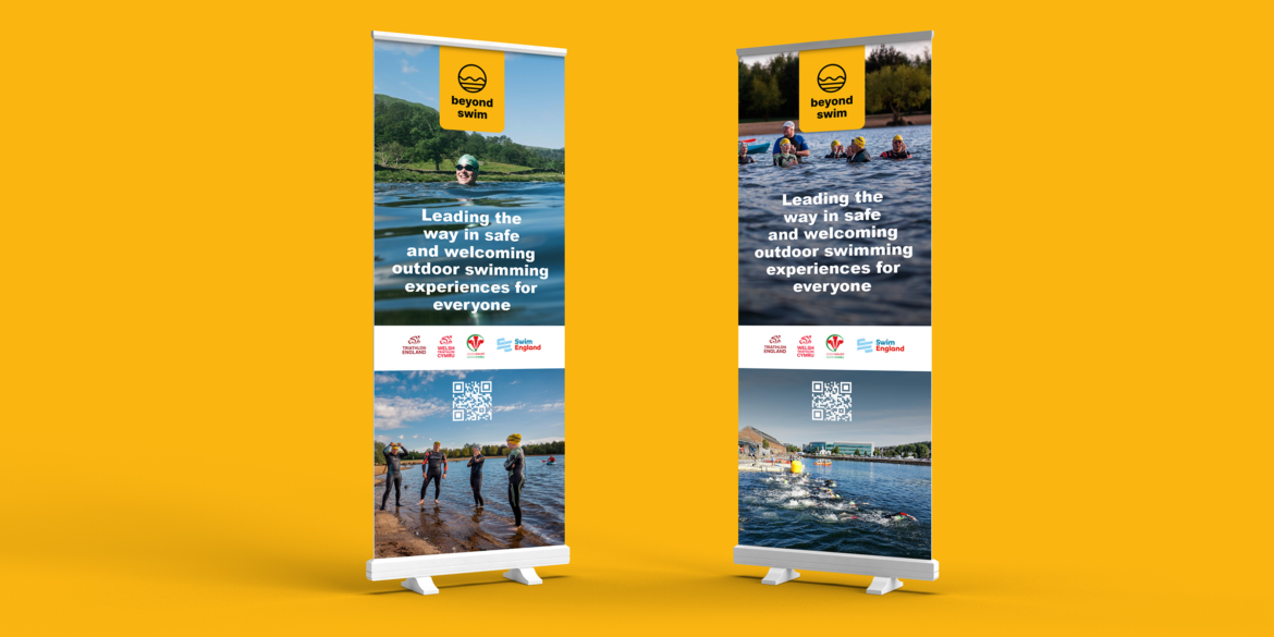
Beyond Swim needed two roller banners they could use at events and conferences. The banners introduce the programme with a clear, confident message about safe and welcoming outdoor swimming experiences for everyone. I used their brand colours, calm imagery and simple typography to help the message land quickly. The banners support Beyond Swim’s mission and give their team a strong visual presence when speaking with swimmers, venue operators and partners.
The finished materials give Beyond Swim a complete set of documents that are easy to read and simple to apply. Everything follows the same visual logic, which helps venues recognise the programme instantly. The interactive checklist also saves time and reduces errors, which is a genuine win for both sides.
This project shows how good design can support safety, clarity and user confidence, even in technical environments. It also highlights how I help organisations turn long, text-heavy documents into tools people actually use.
If you run an accreditation scheme, support outdoor activities or need help transforming complex information into practical, attractive materials, I’d love to work with you.
#